|
|
|
AMELIA BIRD : : : : UNIVERSITY OF IOWA
|
AMELIA BIRD : : : : UNIVERSITY OF IOWA
|
elizabeth boyne : : : : UNIVERSITY OF IOWA
|
EMILY CHAPLAIN : : : : MEMPHIS COLLEGE OF ART
|
EMILY CHAPLAIN : : : : MEMPHIS COLLEGE OF ART
|
ANNE COVELL : : : : UNIVERSITY OF IOWA
|
gabrielle galbreth : : : : MEMPHIS COLLEGE OF ART
|
ARIANA HUBBARD : : : : ARIZONA STATE UNIVERSITY |
JORDAN JACKSON : : : : MEMPHIS COLLEGE OF ART
|
KARL CONNER JOHNSON : : : : ARIZONA STATE UNIVERSITY
|
KARL CONNER JOHNSON : : : : ARIZONA STATE UNIVERSITY
|
KIMBERLY MAHER : : : : UNIVERSITY OF IOWA
|
lee marchalonis : : : : UNIVERSITY OF IOWA
|
ALLISON MILHAM : : : : UNIVERSITY OF ALABAMA
|
JOSHUA ORR : : : : MEMPHIS COLLEGE OF ART
|
LIVIA ORTIZ : : : : MEMPHIS COLLEGE OF ART
|
LIVIA ORTIZ : : : : MEMPHIS COLLEGE OF ART |
CHRISTOPHER SACLOLO : : : : COLUMBIA COLLEGE, CHICAGO |
CHRISTOPHER SACLOLO : : : : COLUMBIA COLLEGE, CHICAGO
|
SUZANNE SAWYER : : : : UNIVERSITY OF ALABAMA |
SUZANNE SAWYER : : : : UNIVERSITY OF ALABAMA
|
SUZANNE SAWYER : : : : UNIVERSITY OF ALABAMA
|
ELIZABETH SHEEHAN : : : : MEMPHIS COLLEGE OF ART |
ELIZABETH SHEEHAN : : : : MEMPHIS COLLEGE OF ART |
SONJA GREENTREE ROSSOW : : : : UNIVERSITY OF ALABAMA |
STEPHANIE WOLFF : : : : DARTMOUTH COLLEGE
|
/ / / / BACK TO SASC
/ / / / ARTBOUND HOME
/ / / ARTBOUND 2010
/ / / ARTBOUND 2011
/ / / ARTBOUND 2014
|
•• 2012 THIRD PLACE WINNER ••
LETTERPRESS ERASURE
Letterpress printed via pressure printing, blind embossing, reduction linoleum block, photopolymer plates, various relief surfaces, and metal type.
11.5 x 7.25"
Edition of 20
Letterpress Erasure utilizes the process of letterpress printing to erase an existing text. On each page, a single block of type has been erased on the press by one of several reductive or additive methods. The visuals of this artist’s book are a tour of color and technique; the text is a commentary on the erasure poetics movement and erasure as both a creative, destructive, and collaborative act.
|
WALDEN MARGINALIA (Honorable Mention)
Case-bound artist’s book. Letterpress printed from photopolymer plates and hand-set Bodoni and Scotch Roman types.
9.25 x 6"
Edition of 50
Walden Marginalia; or, The Contents of a Dozen Shanties is an examination of margin notes in copies of Thoreau’s Walden found in libraries across the country. By withholding the original text to focus solely on the marks of past readers, Walden Marginalia turns the same kind of close attention Thoreau inspired in his readers onto the readers themselves. The text that accompanies the images of marginalia is a personal essay about the reading habits of strangers, assumptions about nature writing and learning, and the lingering effects of Thoreau’s classic work.
With the help of a Project Assistance Grant from the College Book Art Association, this book was completed at an Art-in-Education Book Arts Residency at the Women’s Studio Workshop.
|
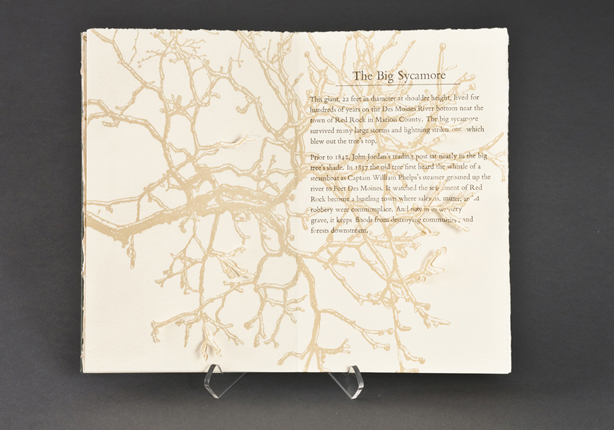
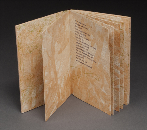
HISTORIC AND MEMORABLE TREES OF IOWA
Letterpress printed with handset metal type and photopolymer plates on Zerkall paper. Drumleaf binding with handmade Japanese paper spine.
4 x 7.75"
Edition of 20
Several of my recent artist books draw upon the day-to-day, idiosyncratic, and personal histories that are found only in the place where a story is rooted. These books attempt to bring attention to the unnoticed, focusing the eye on elements of everyday surroundings that reveal clues of the life that had previously populated it. Historic and Memorable Trees of Iowa examines the history of some of Iowa’s famous trees, calling attention to the life hidden in these long forgotten sentries that once stood as markers of home in Iowa’s open landscape. |
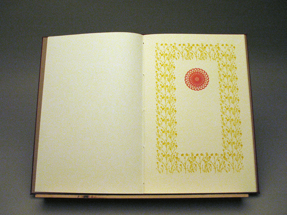
REQUEST
Letterpress printing and digital printing on handmade paper.
12.5 x 8"
Edition of 5
Request was inspired by the prayer “Obsecro Te” that is in many Book of Hours. “Obsecro Te” is a prayer that directly addresses the Virgin and praises her sacrifices and the sorrow she felt as a mother. I used carnations because they are a symbol of motherhood that evolved from their association with the Virgin. In Request carnations bloom then wither down to a single bud as I ask to be spared the suffering associated with maternity.
|
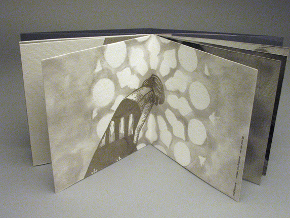
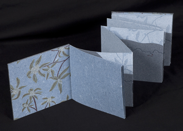
DISPEL
Letterpress printing, linocuts, and pulp painting on handmade paper.
5 x 5"
Edition of 5
In Dispel I explore the idea of feminine and spiritual
perfection, specifically within Catholicism which is the religious doctrine of my family. The imagery is evocative of the light cast from cathedral windows. I use the light and shadow cast from the windows to imply illumination or the revealing of truths and imperfections. At times the window forms seem to loom behind the figure, abstractly suggesting the all-seeing eye of God. |
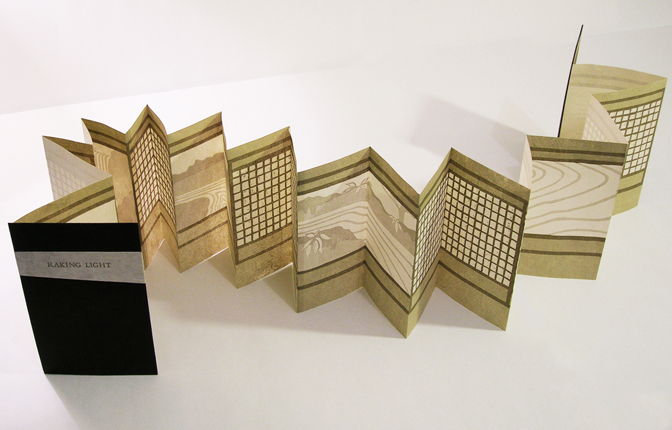
RAKING LIGHT (Honorable Mention)
Accordion printed with linoleum reduction and metal type on waxed handmade Japanese kozo created by the artist.
5 x 3.5" closed, 5 x 54" open
Edition of 20
Raking Light is a meditation on the Japanese aesthetic of wabi-sabi, which seeks to find beauty within the simplicity, austerity, and asperity of a given form or space. This book serves as a study of the subtle and often transient nature of light and shadow in Japanese architecture, and is a reflection of the artist’s own experience walking the raked gardens of Kyoto’s Daisen-In.
|
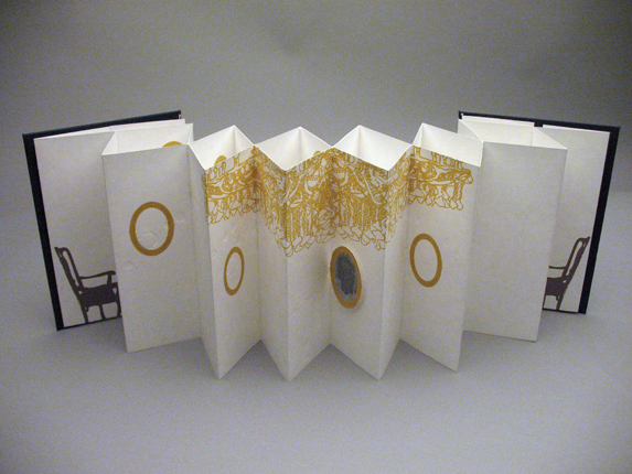
REFRAMED
Digital printing, letterpress, and screen printing. Double concertina binding structure.
5 x 7"
Edition of 5
I’ve used the dining room environment as a metaphor for the emptiness I feel over the loss of my grandfather. In this piece, I am attempting to hold on to his memory. The prominence of the chandelier illuminates the focus of my memories of him through family photographs. My fondest memories of him will forever be of sitting down together at the dining room table while he shared stories of his past. I will always try to hold on to those moments, even though his physical presence will be absent around the table for meals to come. |
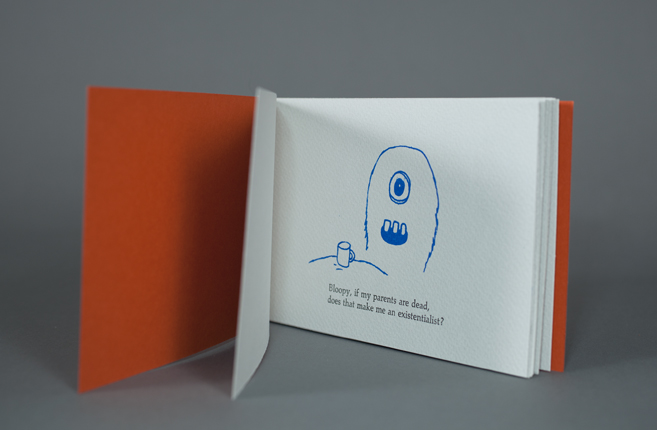
BLOOPY AND MUJU DISCUSS PHILOSOPHY
Letterpress and screen printing, Japanese stab binding.
6.5 x 4"
Edition of 10
Bloopy and Muju Discuss Philosophy combines letterpress and screen-printing. Aesthetically, the characters of Bloopy and Muju were inspired by graffiti I saw on a trip to New York City. My goal was to tie these original figures, created in the style of a non-narrative art form, with a narrative environment in which they would be able to interact. I hope to make this a series, with the second book already in production.”
|
EMBRACE
Giclee and letterpress printing on Oak Tag paper.
12 x 6"
Edition of 5
Embrace focuses on the personal distress brought on as I lose grip with my fading heritage. Hailing from Erzgebirge, a mining town in Germany, my family’s final remaining connection to the rich history of our origin grows ever more distant as time passes on. Using ornament rendered from elements of mining equipment I sought to capture the feeling of being lost in a dark cave with little opportunity of direction or escape. Merely an occasional shimmer of hope as you navigate the intangible corridors of my descent.
|
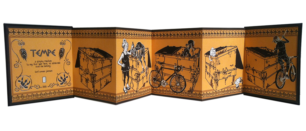
TEMPE
Accordion structure, letterpress printed from photopolymer plates.
7.25 x 6.25"
Edition of 18
Tempe is a graphic reaction to my first year living in Tempe, AZ. I was living in a comfortable but crappy little townhome directly under the inbound flight path to Skyharbor International Airport. From my second story balcony view of the alley dumpster, I was able to observe all of the deposits and withdrawals made in the large communal receptacle. being that the American city of Tempe is named after the ancient Grecian “vale of tempe”, I though it fit to visually model the book after ancient Greek “black-figure” vessel paintings. The motif was changed to fit both my hand as an artist and the unique character of the city that inspired it, with airplanes and nopal replacing olive leaves and seas of saguaro in place of rolling waves (the palm fronds, however, remained the same). Tempe was hand drawn and designed in the spring of 2011. It was printed in three runs from low-tech photopolymer plates and produced in limited edition.
|
WALKIN' ON THE SIDEWALKS
Origami book, digital printing.
8.25 x 5"
Edition of 25
Walkin’ on the Sidewalks is visual description of a song of the same name, written by Alphredo Hernandez and Joshua Homme, performed by the Queens of the Stone Age, and loosely interpreted through the illustrations of Karl Conner Johnson. The intention was to translate aural ques into visual information: musical rhythms into visual rhythms, timbre into texture, pitch into value, etc. The book unfolds in an extended origami form, so the reader can enjoy one page at a time, or take it all in at once. It was produced in limited edition at the Herberger Institute for Design and the Arts in the Spring 2011.
|
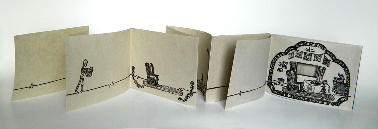
TRES VESES
Accordion structure, letterpress printed from linoleum blocks on handmade abaca paper, slip-case cover is walnut dyed with ink-resist.
6 x 96" (open)
Edition of 20
About Tres Veces: Dia de los Muertos is a day of celebration and love in which the living remember departed relatives. Tres Veces, created in this spirit was influenced by someone I almost lost to suicide. A heartbeat pulses across each page representing the fight to hold on to that loved one. Following the path of the heartbeat a pensive skeleton gathers belongings while walking back and forth across each spread. The piece serves as a reminder to celebrate all of the moments we are still able to have, to cherish them all.
|
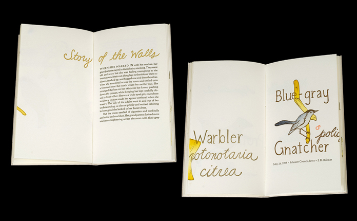
YES, BUT
Linoleum, woodcut, handset metal types (10 and 12pt. Palatino) on Rives Heavyweight. Binding is a modified Conservation papercase (long-stitch). Cover is Lightweight UICB Flax handmade paper. 4 x 9"
Edition of 50
About Yes, but: Made as a tribute to time spent at the University of Iowa in the Library Science program and at the Center for the Book, this book includes texts composed by fellow graduate students Alison K. Greene and Amelia Bird. The images in the book are linoleum cuts of perching birds (order: passeriformes) permanently on view at the Museum of Natural History at the University of Iowa. It is intended as a container for three works (two texts and a series of images) whose themes resonate but are not overtly related. |
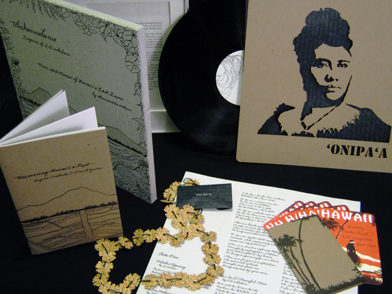
•• 2012 SECOND PLACE WINNER ••
ULUHAIMALAMA — LEGACIES OF LILI'UOKALANI
Letterpress printed handmade artists’ book / music project, housed in a clamshell box. Printed from photopolymer plates and laser engraved wood blocks on cotton abaca handmade paper, chipboard, and French papers.
12 x 12 x 0.75"
Edition of 50
The project explores the occupied state of Hawai‘I; it’s political past and history of organized resistance. Milham combines music composed by Queen Lili‘uokalani, (played and recorded by the artist), with a detailed portrayal of Hawai‘i’s story contained within the accompanying album artwork and packaging. The content plays out in an interactive uncovering; an intense discovery of successive layers to be sifted through, understood and felt. Postcards, 12” laser cut stencil, booklet and other items of ephemera become tools, allowing the viewer to turn their newly acquired knowledge into action.
|
DISCONTENTMENT
Screen printing, letterpress, pulp painting on handmade paper (cotton & flax).
4.75 x 8.25"
Edition of 5
Discontentment: This piece deals with the idea that having moved away from my family I no longer have a defined home. In Discontentment I express my resentment toward the impermanent structures I have been expected to call home.
|
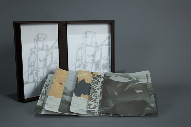
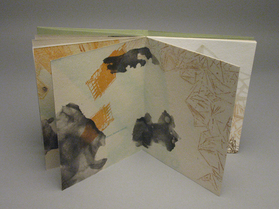
EPHEMERAL CONSTRUCTIONS
Letterpress, pulp paint, watermark and digital impression on handmade paper.
5.5 x 9.5"
Edition of 5
Ephemeral Constructions is based on the anxiety of the excessive urban landscape, which seems to determine the way in which we dwell. Therefore, questioning our existence. This book is made with pulp paint, line bleed, watermark, letterpress and digital impression on handmade paper. |
ILLUSIONS
Letterpress, pulp paint and watermark on handmade paper.
7.5 x 6.25"
Edition of 5
Illusions depict the consequences of those buildings that are symbols of economy and wealth but that in reality are just weak and overwhelming armatures that affect our environment and the way in which we dwell. In this book was incorporated the used of Pulp paint, line bleed, water mark and letter press on hand made paper
|
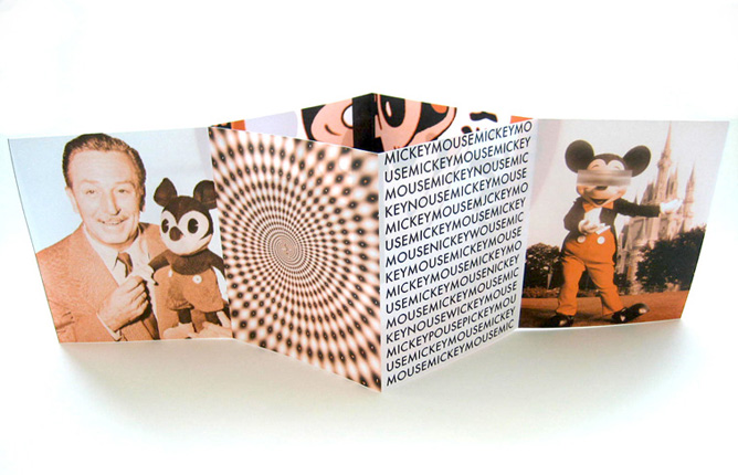
THE TRANSMUTATION OF MOUSE
Heidelberg Offset print, One sheet pamphlet.
4.75 x 5.75"
Edition of 400
The Transmutation of Mouse is an altered origin of the popular American icon Mickey Mouse and its visual change from innocence to disturbing. |
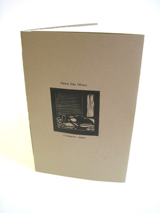
MAHAL KITA MICKEY
Linoleum prints, Pamphlet stitch.
6 x 8"
Edition of 1
Mahal Kita Mickey is about the cultural presence of a popular American icon to a child of poverty in the Philippines. Loosely translated I Love You Mickey, the word ‘mahal’ can also mean expensive in monetary value. This artist’s book represents the ideology of reaching to an American identity.
|
BUT MOVE NOT
Letterpress printed from photopolymer plates on a split edition of handmade flax paper and machine made paper.
6 x 4 x 0.5"
Edition of 31
But Move Not (2012) is letterpress printed in a split edition of machine made and handmade flax paper using photopolymer plates. It was inspired by a trip to the mangroves of 10,000 Islands off the coast of Florida. The text is a poem by Eder J. Williams and the design, images, printing, and binding are by Suzanne Sawyer. |
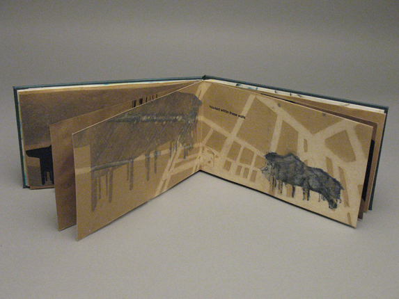
THE HIGH ROAD
Letterpress printed from linoleum reduction blocks and photopolymer plates on handmade denim paper.
5 x 5.5 x 0.5"
Edition of 27
The High Road (2011) is letterpress printed on handmade denim paper using a combination of reduction linoleum blocks and photopolymer plates. It was inspired by the Blue Ridge Parkway, which traces the Blue Ridge Mountains of Virginia and North Carolina. The artist’s grandfather worked for FDR’s Civil Conservation Corps in the 1930s. The front pamphlet describes her grandfather’s history with CCC. The accordion contains a map of the parkway with milepost markers that are significant to the artist’s family history on the parkway. The markers are associated with the memories written by members of the family that are contained in the back pamphlet.
|
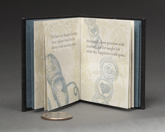
SPEAK
Letterpress printed from linoleum blocks and photopolymer plates on Arches text. Background imagery is digitally printed. Full cloth flat-back case binding with clamshell box.
2.5 x 3 x 0.25" (miniature book)
Edition of 40
SPEAK! (2011) is a poem by William Wordsworth and describes his desire for the woman he loves to finally speak — to put his mind at ease about whether she loves him or not. The imagery was created using a combination of linoleum block and photopolymer plates. It was printed on Arches Text Wove paper. |
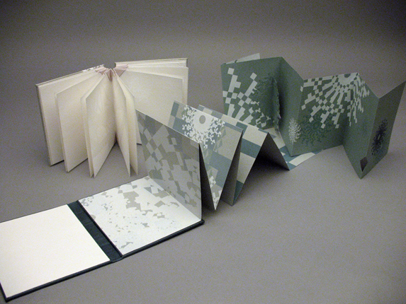
CORUSCATION
Two book set housed in a clamshell box. Book 1: Modified accordion with inkjet printing, screenprinting, and pop-ups. Book 2: blizzard book structure, screenprinting and blind embellishment on handmade paper.
4.25 x 5"
Edition of 5
I am fascinated by the fact that our memories are not simply true accounts of past events but rather are fabricated from fragments of reality, stories, and interpretations. The amalgamation of these things along with the degrading effects of time often results in the idealized glimmer of a blurred memory, half forgotten. Coruscation explores the light and idealization of the fragments of our memories. The ornamentation becomes reminiscent of a kaleidoscope’s use of light to interpret shards of reality but also reinforces the idea of seeing someone in a better light, as we may see them through our idealizations and recollections.
|
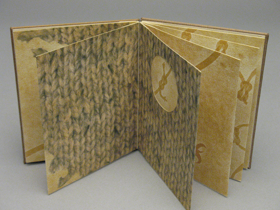
MENDING
Portfolio bound book with inkjet printing, pressure printing, and handset type on paper handmade by the artist from cotton linter.
4 x 5"
Edition of 5
Mending explores the duality of both craving the relationship that used to be and questioning the memory of that relationship. The remnant of a knitted garment—representing the warmth and closeness once shared—has frayed and deteriorated with time and neglect. The deterioration of the garment correlates to the diminished bond we currently share but also begins to question the validity of my recollections of that relationship’s warmth. The knots act both as my futile attempts to mend that relationship and my attempts to reconcile my memories of the past with reality.
|
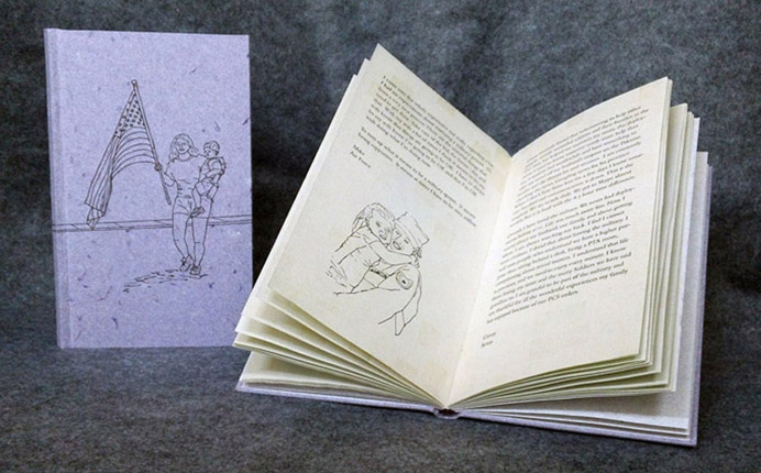
HOLDING DOWN THE FORT
Letterpress printed from photopolymer plates onto handmade paper.
8 x 4.5"
Edition of 50
In my latest work, I’ve collected stories from men and women who are military spouses. In this era of war, we think about the veterans, but neglect the fact that many of these people have families. I wanted to focus on them and what they have to say about being a military spouse. The good and the bad. I also wanted to give a historical perspective through letters and diary entries of those women who stayed behind while there husbands went off to war. In the end, I discovered we are not so different from one generation to the next in what we feel as spouses of those serving our country.
All of the paper in the book reflects the stories within it. The cover material and end sheet were made from clothing purchased at the Maxwell AFB thrift shop. The text block paper was made from my husband’s desert camouflage uniforms.
|
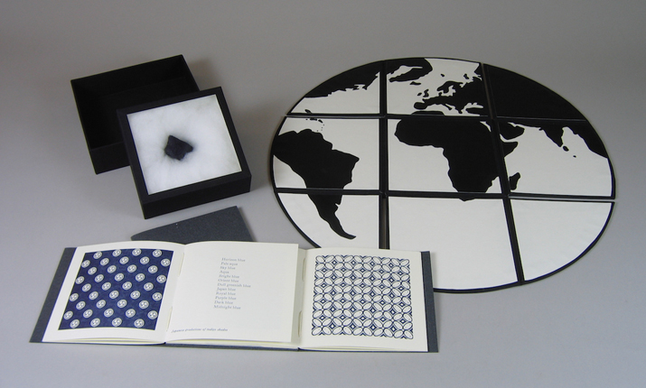
•• 2012 FIRST PLACE WINNER ••
A WORLD OF BLUE
Letterpress printed with metal type and polymer plates on Rives Heavyweight paper and bound into a St. Armand paper cover. Drop-sided box indigo book cloth over boards, acrylic ink painted map.
17 x 17 x 3"
Edition of 20 (5 with box).
About A World of Blue: The simplest societies have long held indigo in their dyepots, coloring plain cloth from native plants. Yet indigo was also traded along the Silk Road, and dispersed through the European west, eventually becoming a global commodity. Indigo’s wide and deep reach provides a complex history and intersects with many disciplines—religion, early trade, plantation economies, the semiotics of textiles, and the science of color. Over time indigo marked our world both visually and linguistically. This artist book, A World of Blue, emerges out of these marks.
|